Responsive Web
Re-Design
Timeline: 6 Months
Role: UX Researcher, UI Designer, UX Tester
Tools: Figma, UX Pressia

Overview
In response to the growing demand for convenience and accessibility, Cashmere aims to improve it's online presence by developing a user-friendly and informative website. The primary objective is to create a seamless and intuitive platform that assists customers in locating the nearest retailer stocking the company's products.
what’s the problem here?
Cashmere's customers struggle to easily find nearby stores selling their products online. Existing methods are inconvenient and unreliable, leading to frustration and potential loss of sales. The lack of a user-friendly website with accurate store locators exacerbates this issue. The company needs a solution that offers seamless online access to nearby retailers, improving customer satisfaction and sales opportunities.

project goals
develop
A user-centric responsive website that prioritizes ease of use and accessibility.
enhance
Customer experience by providing accurate and efficient store location services.
increase
Customer satisfaction and brand loyalty through streamlined online interactions.
improve
The company's competitive advantage in the market by offering a superior online shopping experience.
DESIGN THINKINg APPROACH
I applied the Double Diamond framework to stay user-focused and outcome-driven—starting with deep research to define the core problem, then rapidly exploring and refining solutions that balanced user needs with Cashmere’s brand and retail goals.
Jessica Moore • 34
Marketing Manager • Suburban Ontario
Married • 2 kids
DESIGNING FOR JESSICA
PAINS
Frustrated when she can’t buy from the brand’s website
Finds it tedious to track down which retailers carry specific products or pack sizes
Sometimes abandons the brand if availability feels uncertain or unclear
Wants to feel confident she’s buying the right product variant from a trusted source
behaviours
Researches products online before purchasing
Uses brand websites to compare options and check availability
Typically adds toilet paper to large grocery hauls from major retailers like Walmart or Loblaws
Values clarity: if she sees it online, she wants to know exactly where to get it
GOALS
Wants high-quality, soft toilet paper that’s gentle for her family
Looks for brands that feel premium but still offer real-life convenience
Supports companies that show purpose — whether through sustainability or community work
User Stories meet business requirements
Using insights from our core persona — a quality-conscious, convenience-driven parent shopping across multiple retail channels — I translated user motivations, behaviors, and pain points into clear user stories and supporting business requirements.
-
As a shopper, I want to know which retailers carry Cashmere, so I can easily find and purchase it without guessing or searching multiple sites.
Business Requirement:
→ Display a store locator or list of online/in-store retail partners on product pages.
→ Do not enable direct-to-cart functionality on the brand site. -
As a shopper, I want to compare product types and pack sizes, so I can choose what’s best for my household needs.
Business Requirement:
→ Include clear, detailed comparisons of product features and pack sizes.
→ Ensure copy and visuals match SKUs available at retail partners. -
As a shopper, I want to be able to click a link to buy from a trusted retailer, so I can complete my purchase quickly and confidently
Business Requirement:
→ Add outbound links to major retailer product listings.
→ Open in new tab and track click-through rates for marketing insights. -
As a values-driven customer, I want to understand how Cashmere gives back, so I feel good about supporting the brand.
Business Requirement:
→ Include a visually engaging section that showcases partnerships, community events, and sustainability initiatives.
→ Avoid gating this content behind menus or subpages.

IA AUDIT / redesign
I audited the site’s information architecture to align with user stories and persona insights. Key changes included prioritizing retailer links, simplifying product navigation, and surfacing brand purpose. The redesign made it easier for users to find and understand products, while respecting the business constraint of retail-only sales.
old Site Map
Linear and scroll-heavy, the old site made it hard to compare products or find where to buy, limiting both usability and brand storytelling.
Revised site map
The new structure separates key content, making it easier to shop, explore the brand, and connect with Cashmere’s purpose—while supporting retail-driven goals.
Ideating a few wireframes
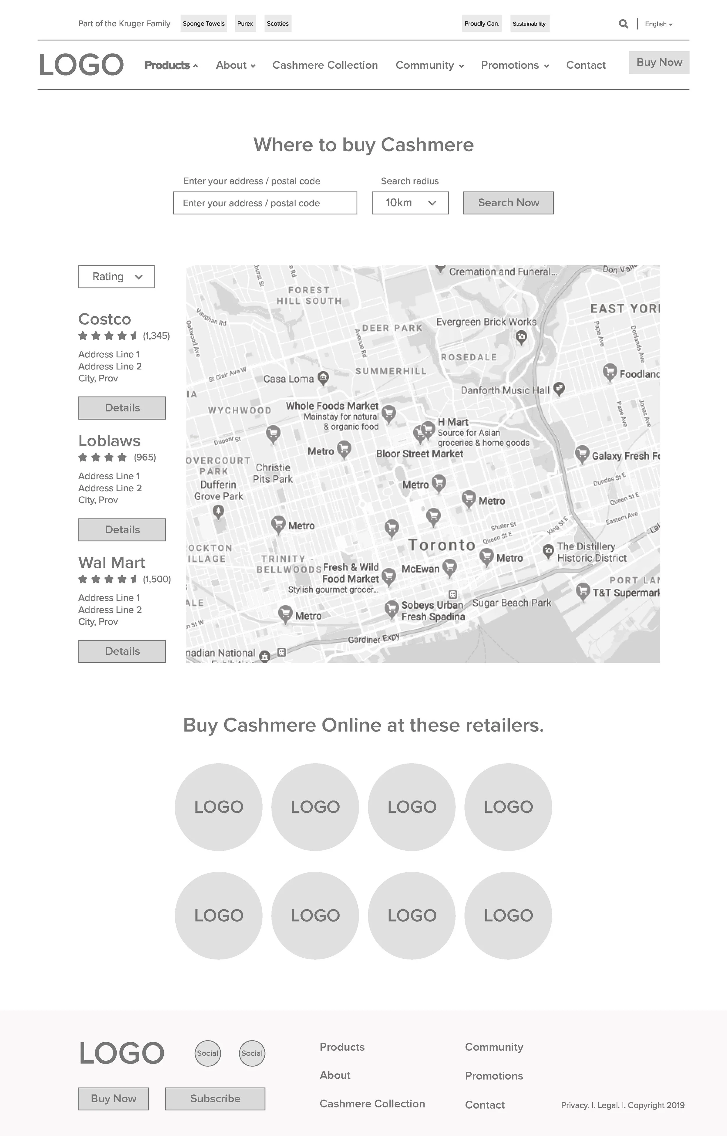
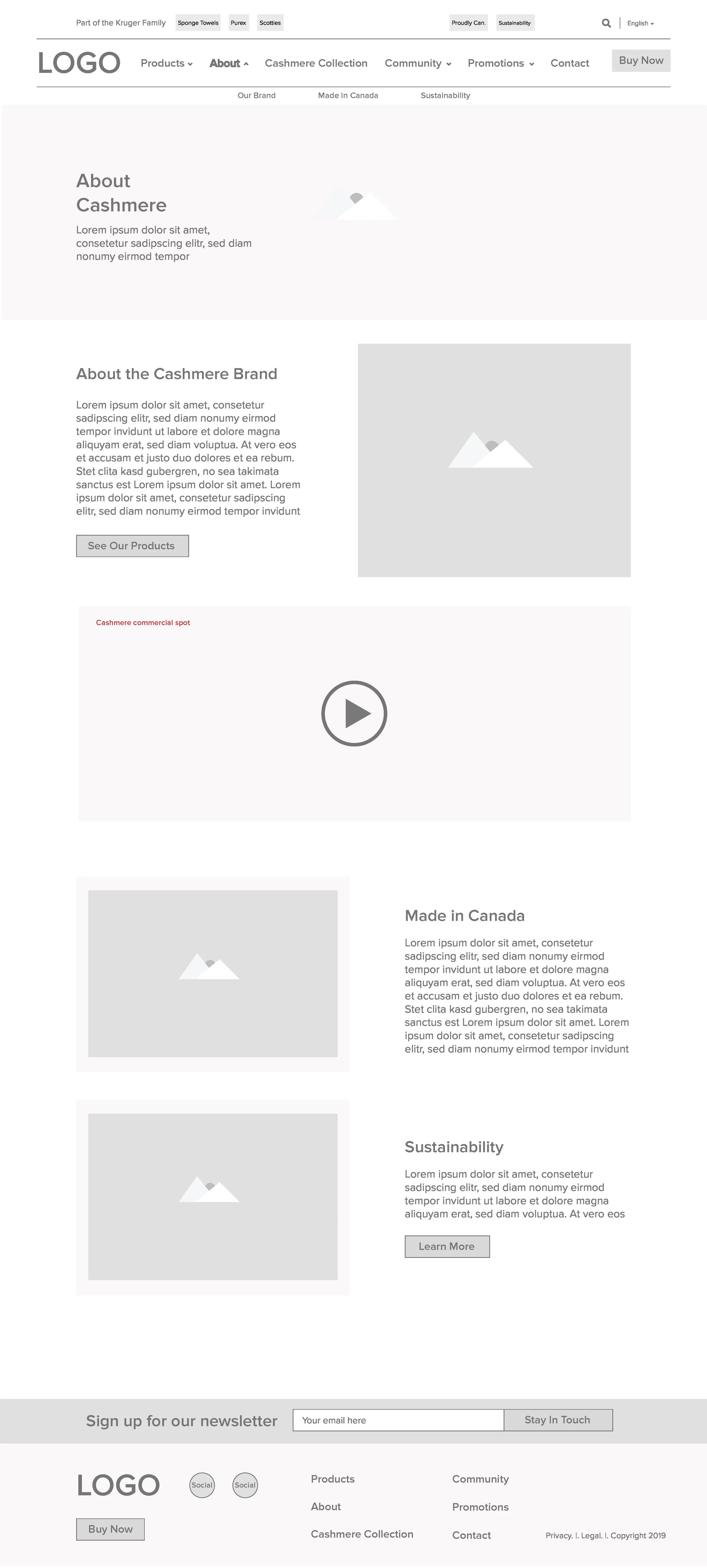
I designed wireframes based on user stories, sitemap and persona insights—prioritizing product clarity, store locator access, and brand purpose. Each layout aligned with business needs and followed the new sitemap to create a seamless experience that addressed both user pain points and retail-driven goals.
Homepage
Communicate brand identity quickly.
Funnel users to explore product details.
Strengthen visual hierarchy in the hero section
Consider CTA contrast and placement for “See Our Products”
Store Locator Page
Support offline sales and drive foot traffic
Reduce “where to buy” support inquiries
Show in-stock status or allow filtering by available products
Improve mobile usability of map and results display
Product Detail Page
Boost confidence to buy via social proof and variety
Showcase positive reviews and nudge conversion
Surface key benefits as bullet points near the image
Enable real-time pack availability for online vs. in-store
Community Page
Strengthen brand loyalty
Differentiate Cashmere from generic competitors
Consider interactive carousels for event highlights
Add social media tags or sharing components

TESTING and FEEDBACK
By testing with both stakeholders and real users, we uncovered usability gaps and content issues that impacted the overall experience. We evaluated each piece of feedback based on severity, effort to fix, and its impact on user goals. This helped us prioritize the most critical improvements to implement during the hi-fi stage and ensure the final design was both user-friendly and aligned with business objectives.
| Feedback Point | Severity | Effort to Fix | Impact on Goal Completion |
|---|---|---|---|
| Store locator lacks feedback for failed search | High | Medium | High |
| “Buy Now” CTA is inconsistent and not prominent | High | Low | High |
| Roll count UI is overwhelming | High | Medium | Medium |
| Community/CSR content isn’t prominent enough | Medium | Low | Medium |
| Overloaded nav with equal-weight links | Medium | High | Medium |
| Product images lack interactivity | Medium | Low | Low |
| Promotions page lacks urgency or persuasion | Low | Medium | Low |
| Review section lacks filtering/sorting | Low | Medium | Low |
Consulting a stylist
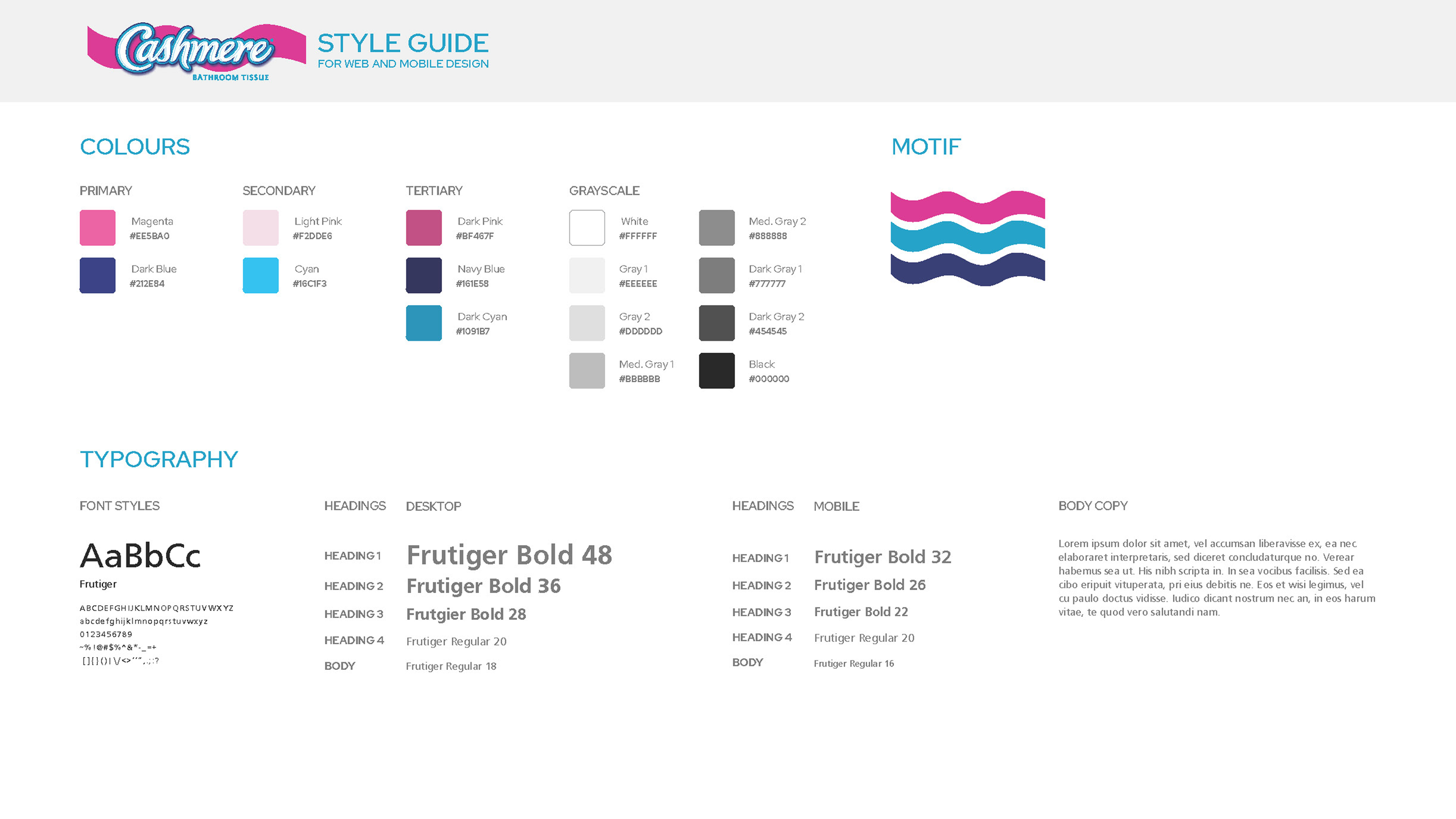
To maintain brand integrity and ensure consistency across the experience, we grounded our design decisions in Cashmere’s existing brand guidelines. By translating these into a scalable design system—spanning typography, color, iconography, and components—we created an interface that not only feels cohesive but also reflects the softness, simplicity, and warmth of the Cashmere brand.


Designing a responsive solution
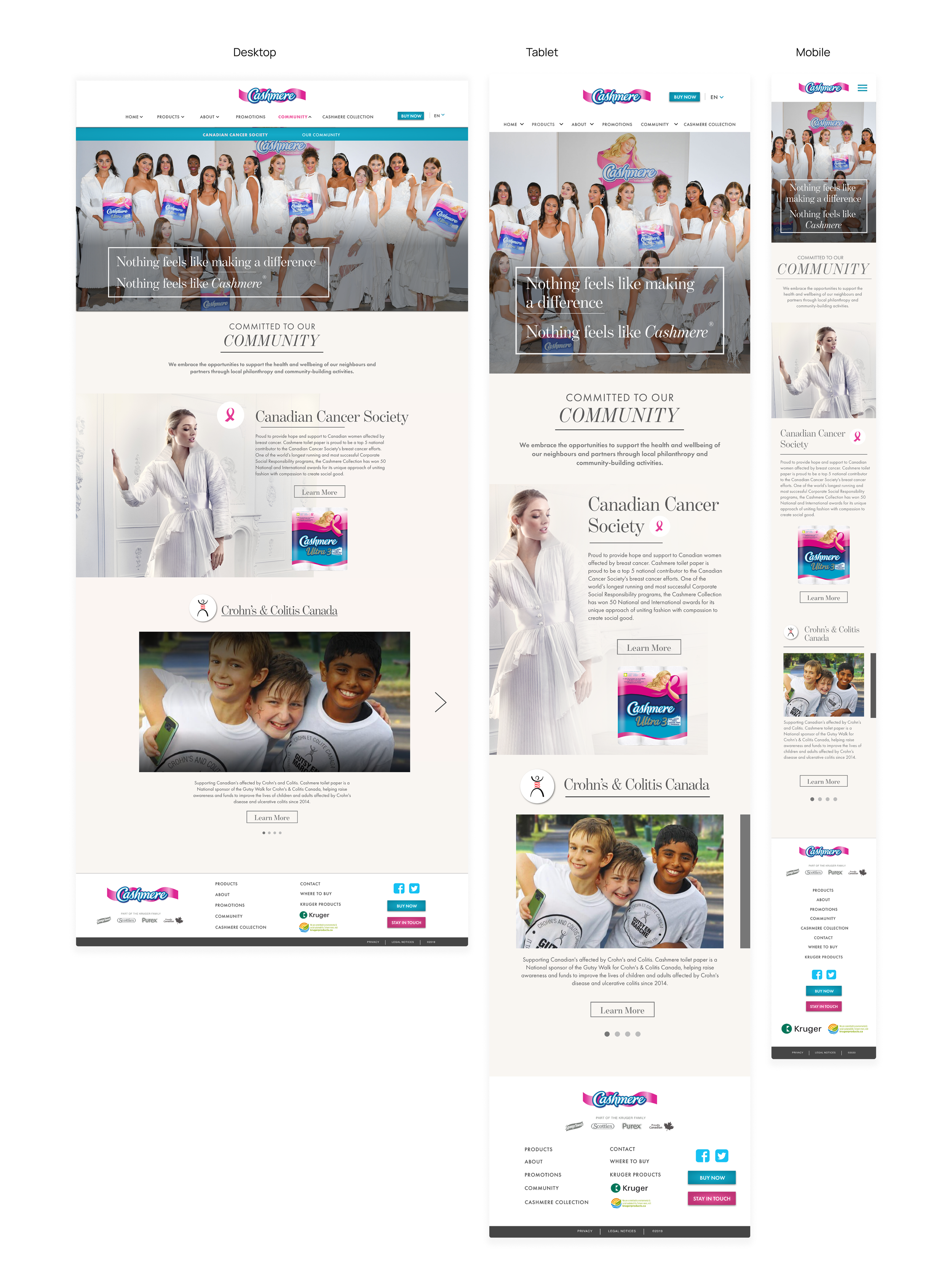
In the high-fidelity stage, we incorporated feedback from user and stakeholder testing to refine the UI—enhancing clarity, usability, and overall experience. We also made the design fully responsive, analyzing the most common breakpoints users access the site from and tailoring layouts to fit seamlessly across devices.
Throughout, we stayed aligned with the Cashmere style guide to ensure consistency in components, patterns, and tone—resulting in a polished, on-brand experience that reflects the warmth and softness of Cashmere’s personality/


adapting for french CANADIAN translation
To support French Canadian translation, we refined the layout to handle longer copy without compromising the design. Collaborating closely with our copywriter, we ensured that text-heavy elements—such as buttons, navigation, and body content—remained legible and visually balanced. This allowed us to maintain a consistent, accessible experience across both English and French, while staying true to the Cashmere brand.

KEY TAKEAWAYS
Emphasize UX & Brand Impact
The redesign delivered a clearer, more intuitive experience that aligned with Cashmere’s brand personality—soft, premium, and modern. By implementing a responsive design system and improving content flow, we laid the foundation for a consistent and engaging customer journey across devices.
Reference Usability Testing & Feedback
Stakeholder and user feedback guided key refinements throughout the process. From layout adjustments to clearer CTAs and improved mobile performance, the final design reflects a collaborative, insight-led approach.
Point to Scalable Foundations
Beyond the screens, we established a reusable design system and scalable UI framework. This sets the stage for easier content updates, multilingual support, and future e-commerce integration if desired.


