

M&S
Project Overview
Role
Product Designer, UX Researcher
Platform
iOS Mobile App
Tools
Figma, Jira, Miro
Timeline
12 Weeks
The existing experience of the M&S iOS mobile app made it difficult for users to quickly access and explore food-related content. Navigation was fragmented, entry points were unclear, and the overall structure required too much effort to reach key destinations.
This project focused on rethinking how users discover food content—shifting from a navigation-heavy experience to a more intuitive, discovery-first model.
The Problem
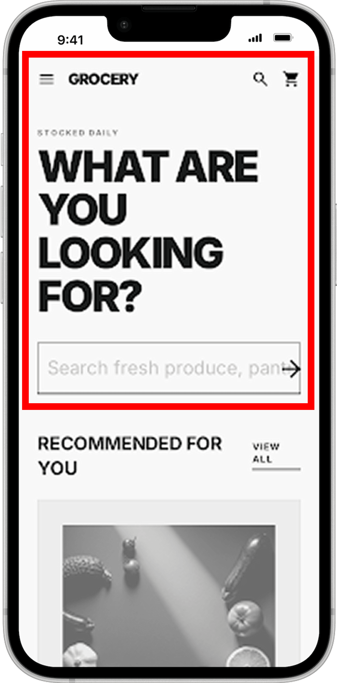
The experience relied heavily on layered navigation and text-based menus, creating friction at the very first interaction point. Users struggled to:
Quickly locate the food section from the homepage
Understand where to begin their journey
Navigate between recipes, products, and categories seamlessly
Project Objectives
Understand user pain points, motivations, and behaviours
Identify opportunity areas within the current experience
Apply blue-sky thinking to explore bold, creative ideas
Design future-forward features that reimagine the food experience
Current State
The original flow required users to navigate through multiple layers, interpret unclear labels and make decisions with limited context. This resulted in unnecessary friction and slower access to key content.
Project Constraints
The redesign was approached within the context of an existing M&S ecosystem—not a blank slate.
Key constraints during this process included:
Maintaining familiarity for returning users
Working within an established content and category structure
Supporting both inspiration (recipes) and commerce (products)
Designing for mobile-first behavior
Points of Interest
Analysis of the current experience revealed three core breakdowns impacting discoverability and navigation efficiency:
1. Unclear Entry Points
Users were not given a strong or obvious way to enter the food experience from the homepage.
2. Fragmented Navigation
Multiple disconnected paths led to similar destinations, creating confusion and inefficiency.
3. Low Visual Hierarchy
Content was presented in a way that made scanning and discovery difficult, increasing cognitive load.
Design Principles to solve the current problem
To guide the redesign, I established three principles:
Reduce Steps to Content:
Minimize the number of actions required to reach food-related content.
Lead with Visual Discovery:
Prioritize imagery and content modules over text-heavy navigation.
Unify Navigation Paths:
Create a single, cohesive entry into the food experience rather than multiple competing paths.
Field Research to understand user’s
shopping behaviours
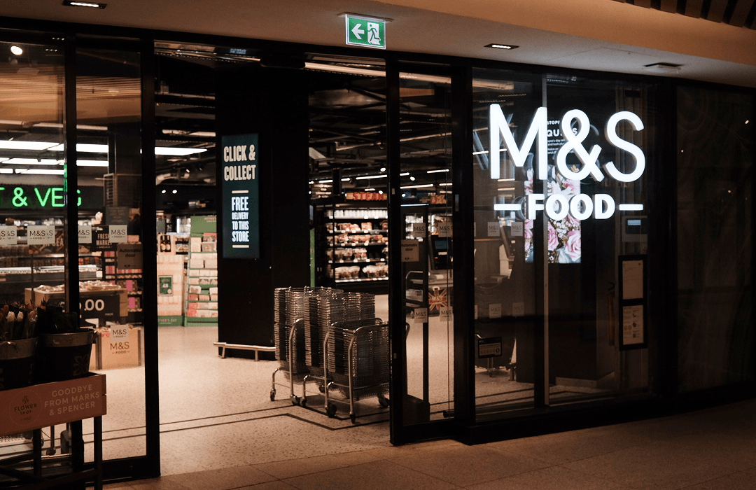
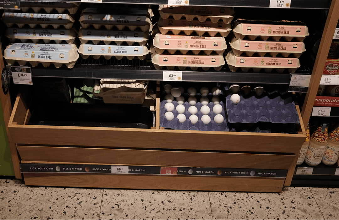
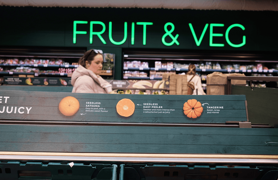
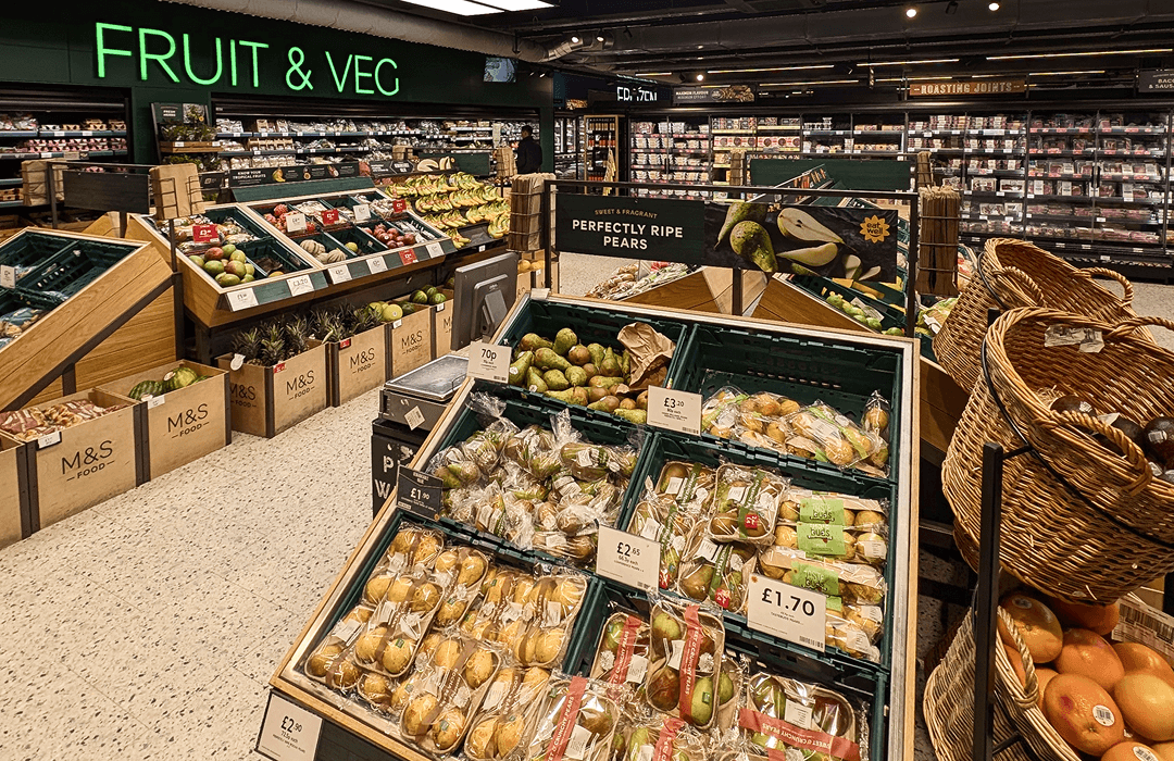
To better understand the customer experience, I visited one of their flagship locations with key stakeholders.
By observing customer behaviours and interacting with the space firsthand, I gained a deeper understanding of how the brand communicates its values in-store: quality, generosity, and ease. These insights are essential in ensuring that digital touchpoints—especially within the app—reflect and extend this brand feel.
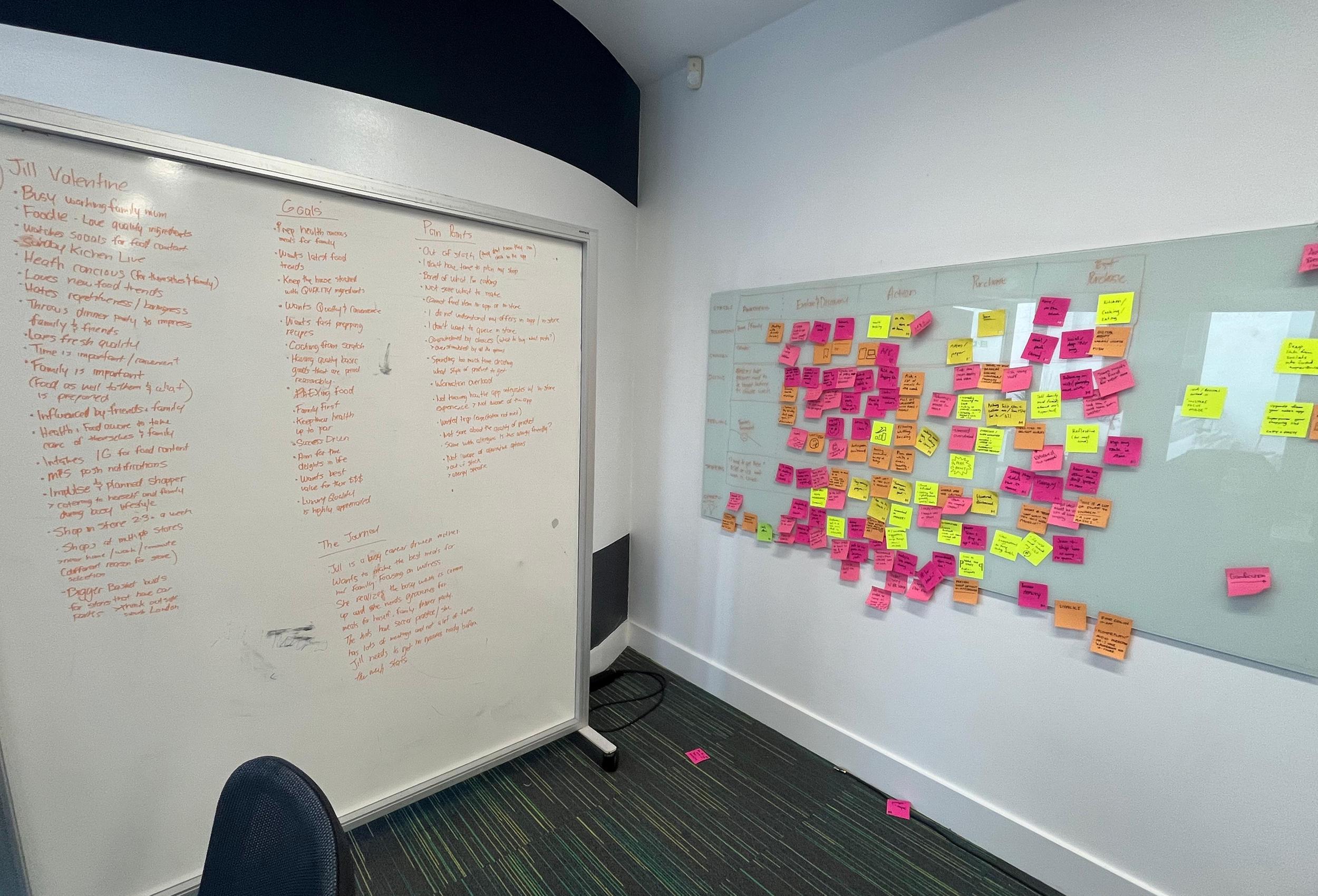
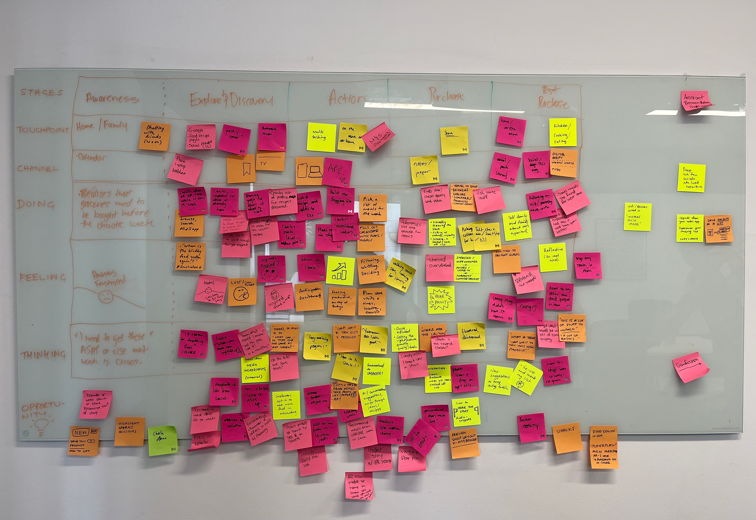
Design Thinking Workshop
I facilitated a design thinking workshop with key stakeholders to deeply understand who our users are and how they currently experience the product. Through collaborative exercises, and useful existing customer data I unpacked user behaviours, needs, and pain points, mapping these insights into a clear, focused persona. This foundation helped align the team and provided a shared lens to guide ideation and shape more user-centered solutions.
Journey Mapping & Persona Creation
Insights & Emerging Themes
Focus on the pre-store experience: what inspires users to visit and what drives repeat behaviour

Desire for a more human, relatable experience within the app

Users are influenced by what others are trying and recommending

Strong motivation to visit due to new and limited products frequently launching

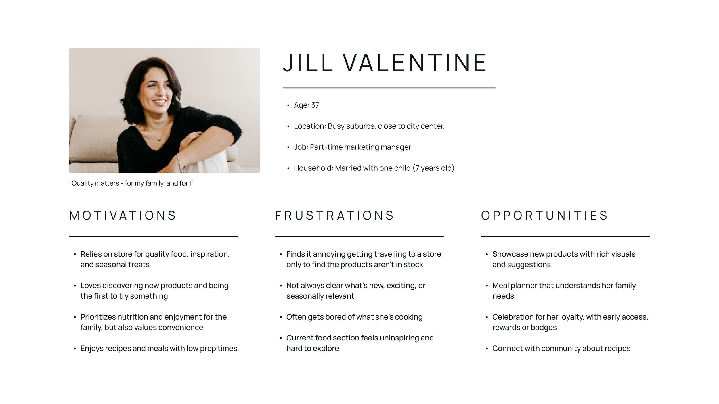
Key User Persona
Our persona, Jill, was shaped from key insights gathered during the workshop, supported by existing customer data provided by stakeholders. We mapped out real-world scenarios to better understand user behaviours, identifying core pain points, motivations, and opportunity areas.
Moments of Opportunities
These opportunities informed the direction of the redesign and helped translate insights into actionable improvements.

Key Design Decisions
Each decision was made to reduce friction while maintaining familiarity for existing users:
Shift to Discovery-First
Moved away from navigation-heavy menus toward visually-driven entry points.
Consolidate Pathways
Reduced multiple overlapping navigation routes into a single, clear flow.
Prioritize Content Hierarchy
Structured content to guide users naturally from browsing → exploration → action.
Improved Task Flow
I redesigned the flow to simplify the journey by introducing a clear, direct entry point and reducing the number of steps required to reach food content.
Testing & Validation
Early wireframes were evaluated to understand how users navigated discovery, interacted with content, and transitioned from browsing to action. These findings informed key refinements that shaped the final high-fidelity experience.
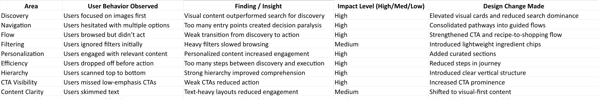
Wireframe Revisions
User testing of the wireframes surfaced high-impact insights that directly informed the evolution of the hi-fidelity designs, strengthening the overall experience and shaping a more intentional, guided user journey.
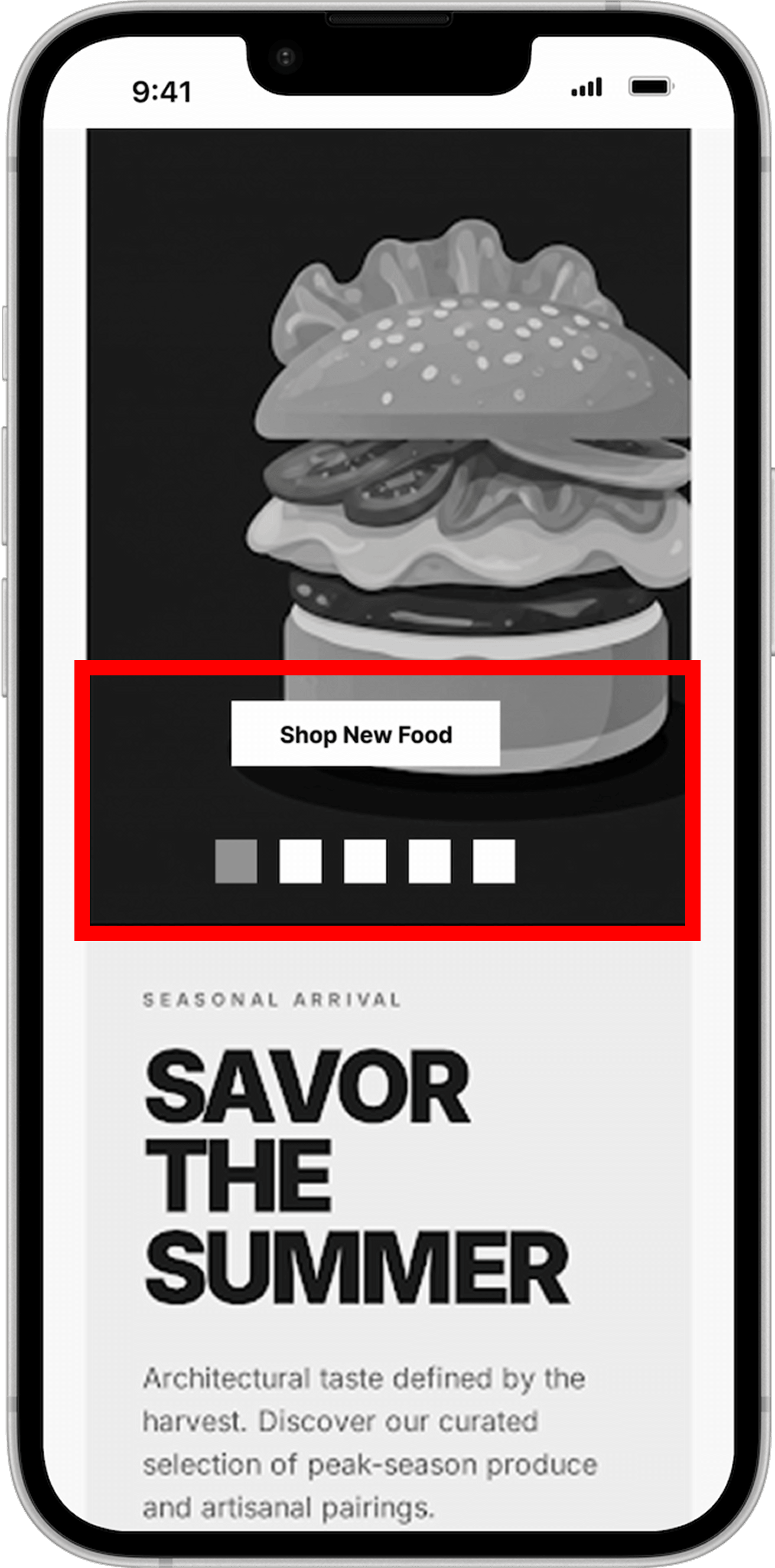
Revise CTA / Add Supporting Copy
"Shop New Food" was too ambiguous, leaving users unsure of what to expect. The label was updated to "Explore New Recipes" to provide clearer direction and align with a discovery-driven experience.
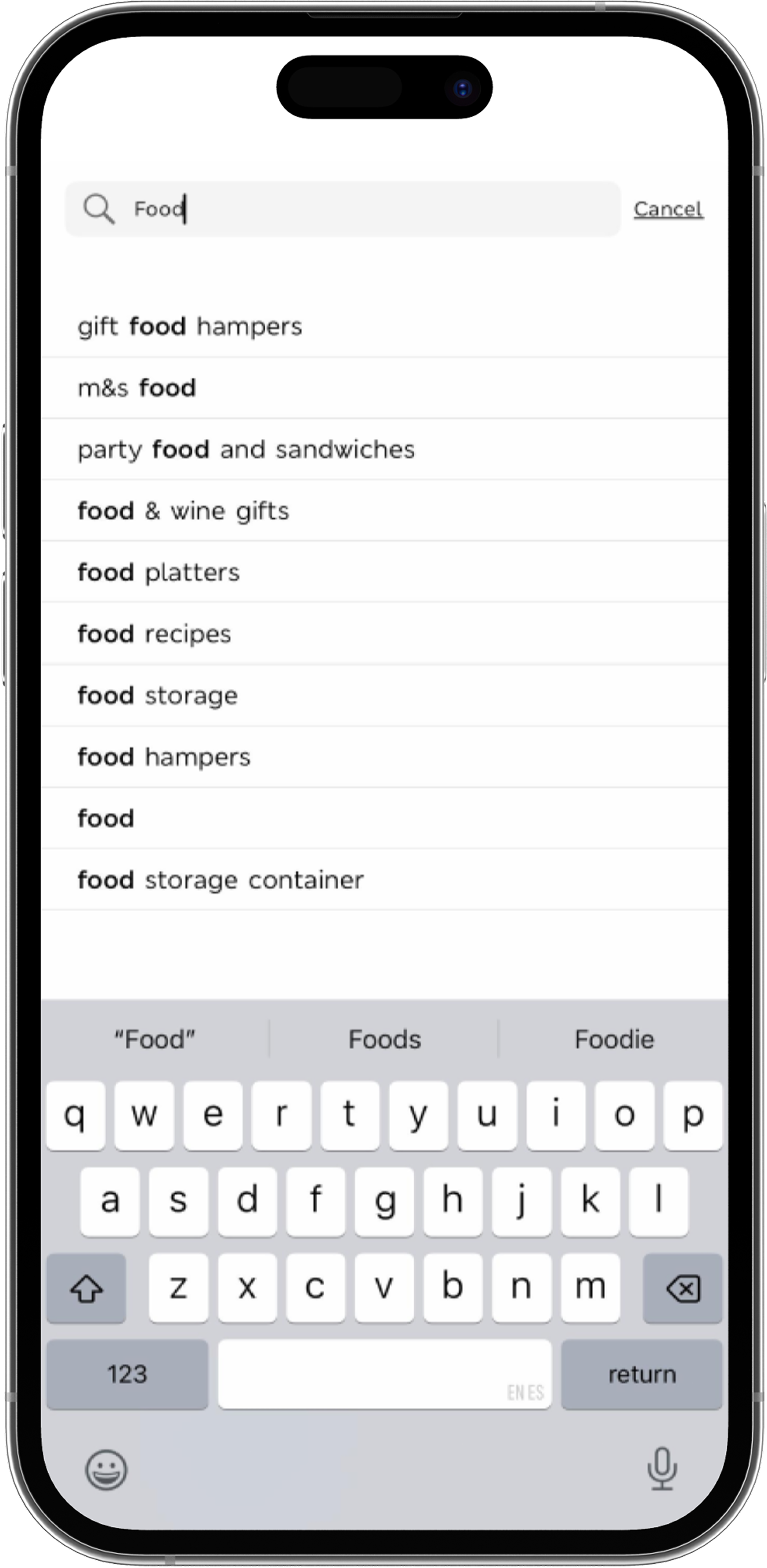
Shifting from Search to Discovery
Relying on search as the primary entry created friction, as users often didn't know what to look for.
The experience was updated to surface in-stock items and relevant recipes immediately, enabling faster discovery and reducing the need for search-driven navigation.
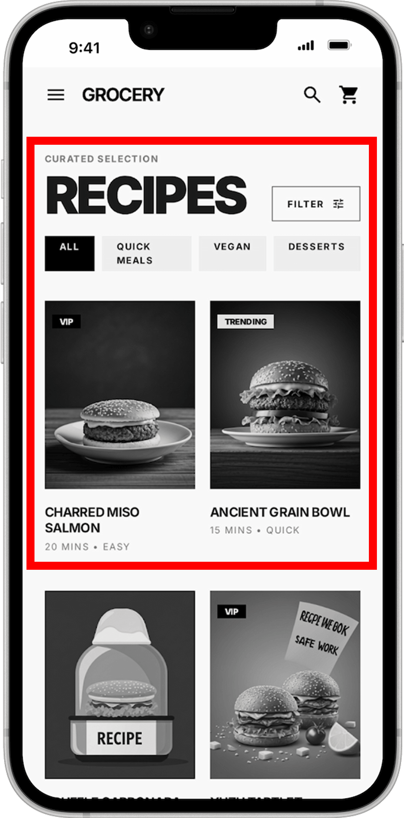
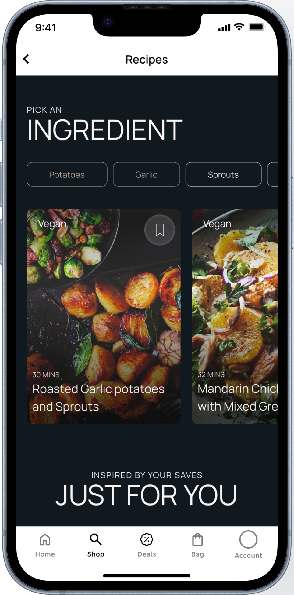
Reducing Cognitive Load in Recipe Browsing
Users struggled to quickly scan and navigate recipe content due to weak hierarchy and heavy filtering.
Applying principles of visual-first discovery and reduced cognitive load, the screen was refined with stronger imagery, clearer structure, and simplified category selection.
Food Discovery Reimagined
With a clear understanding of user pain points, opportunities, and goals, the food discovery experience was reimagined within both existing and newly defined brand guidelines. The redesign applies key design decisions around simplifying navigation, prioritizing visual-first discovery, and unifying entry points to create a more intuitive and cohesive journey.
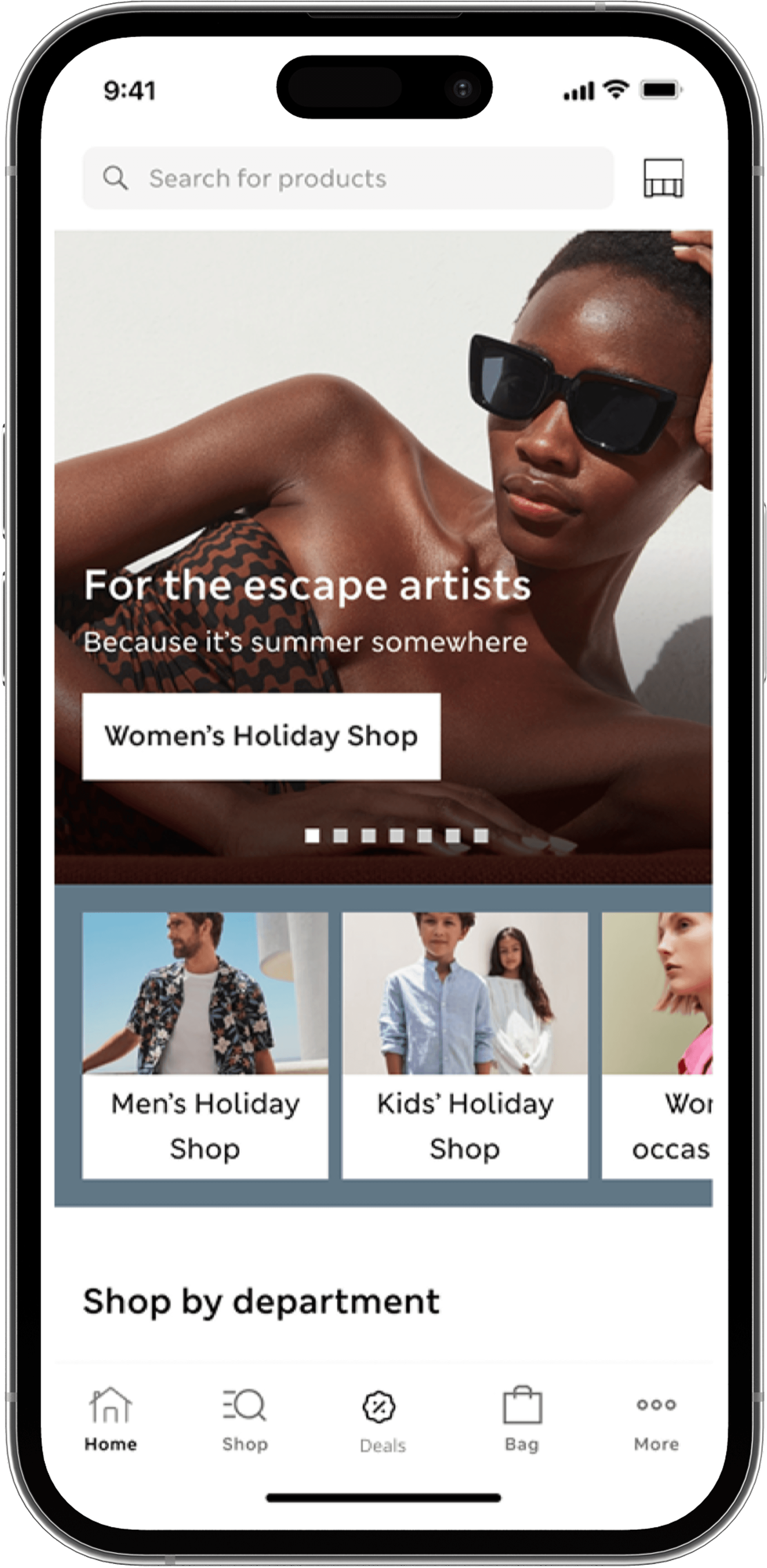
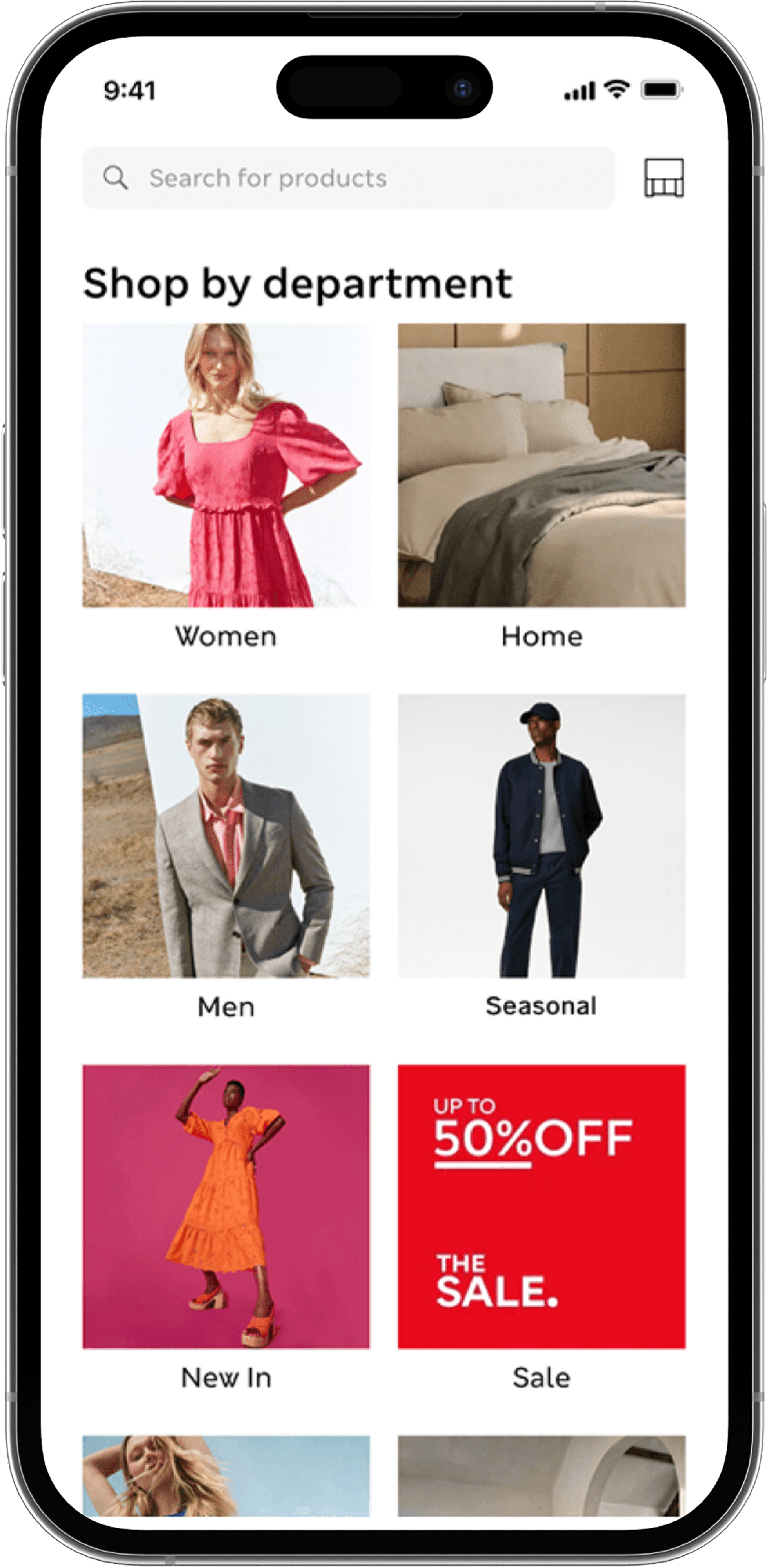
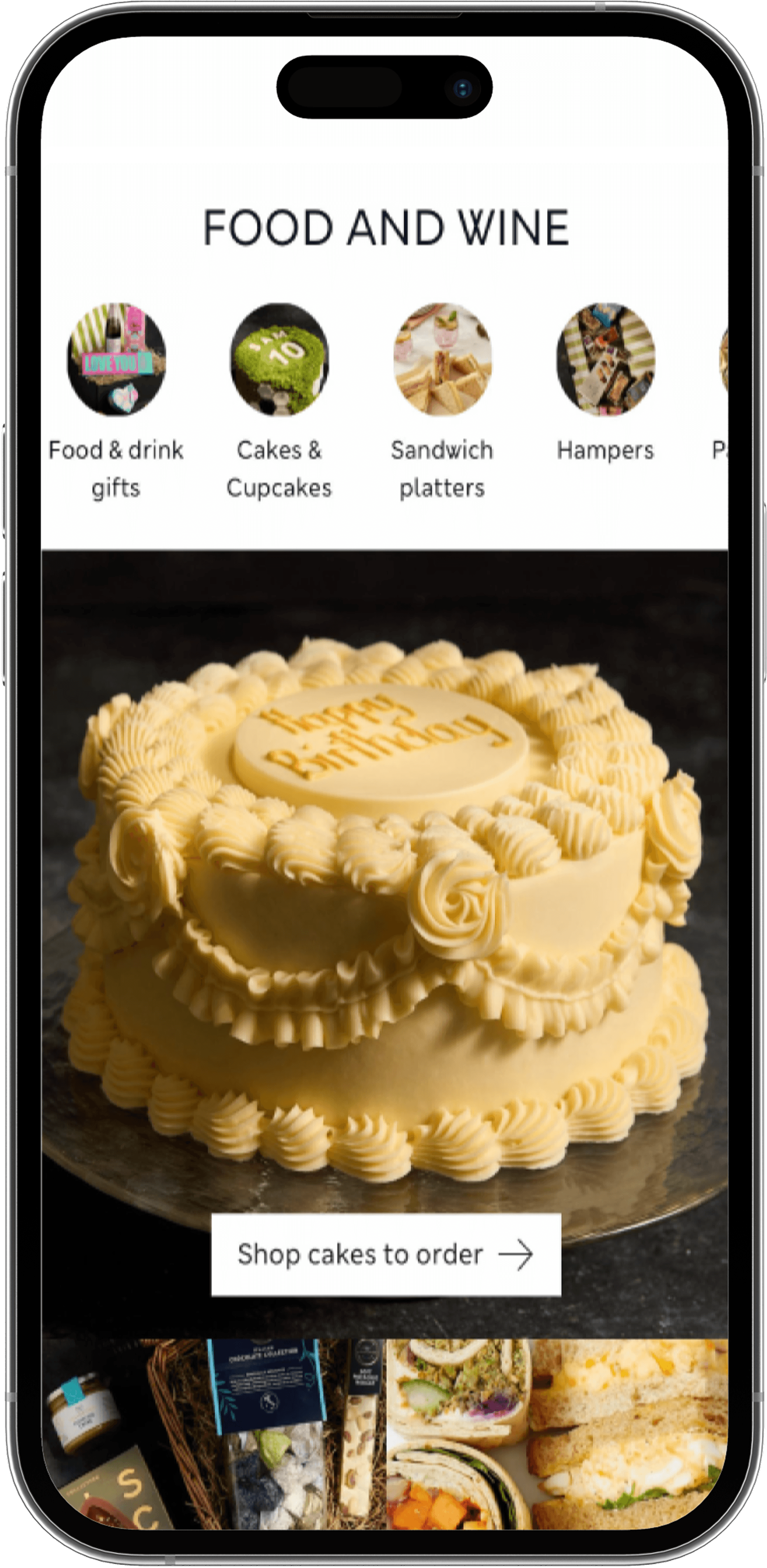
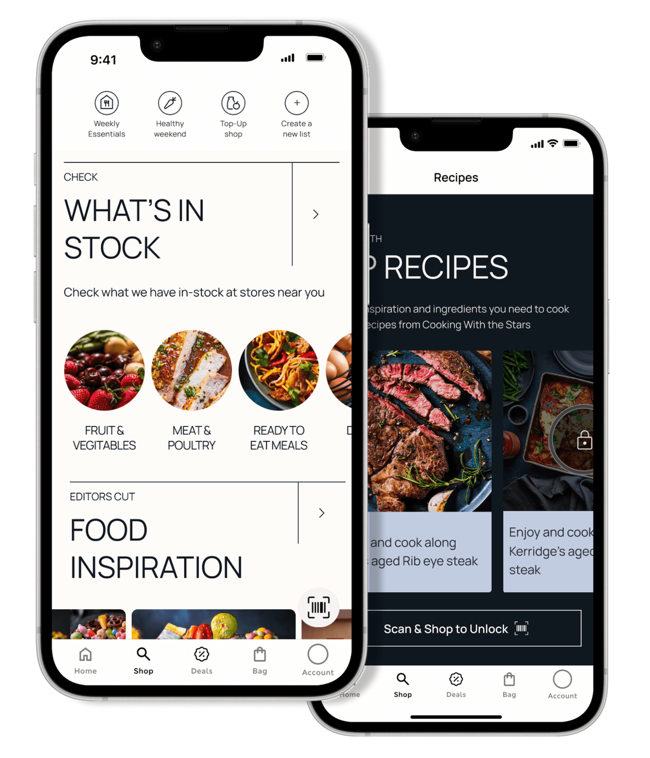
Improved Food Landing Screens
The original experience leaned heavily on long-form content with limited hierarchy, requiring users to interpret the message and determine their next steps independently. The redesigned experience introduces a structured layout with clear content groupings, visual hierarchy, and strategically placed calls to action—making it easier for users to understand, engage, and act.
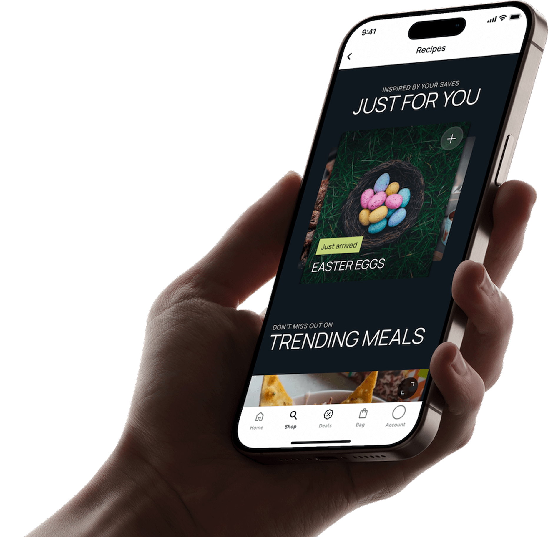
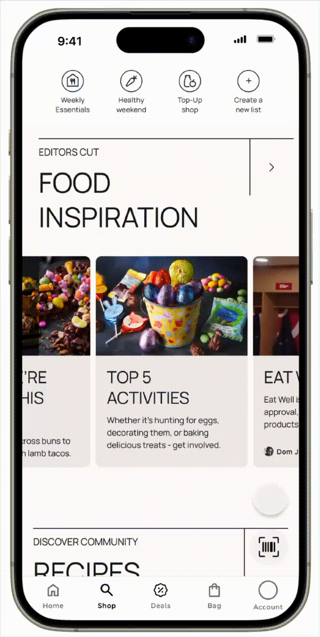
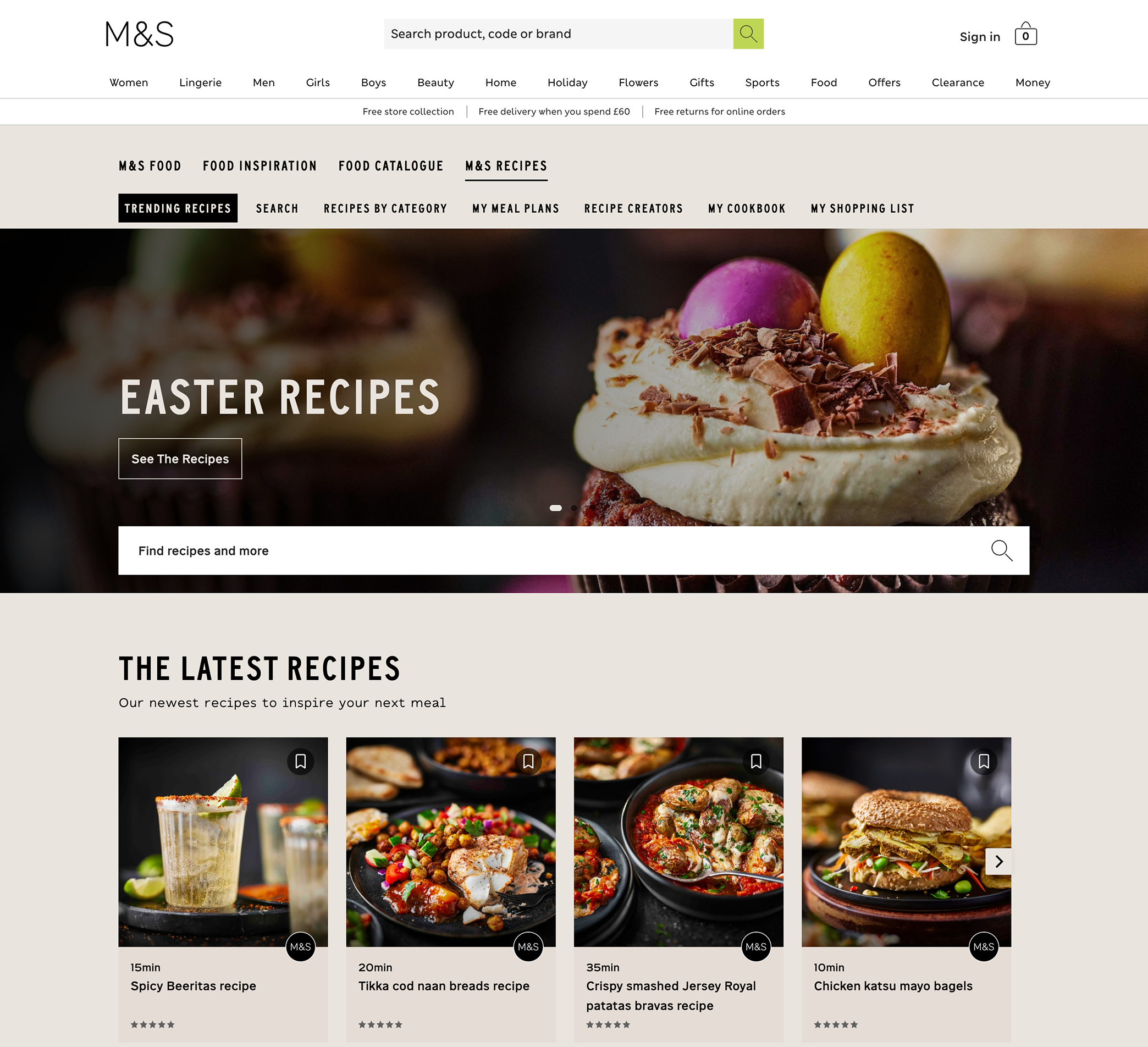
Food Inspiration section
The redesigned Food Inspiration section transforms browsing into a guided, engaging experience by surfacing relevant recipes, seasonal content, and trending meals right from the start. Instead of relying on search, users are inspired through curated collections and visually rich content that make discovery effortless.
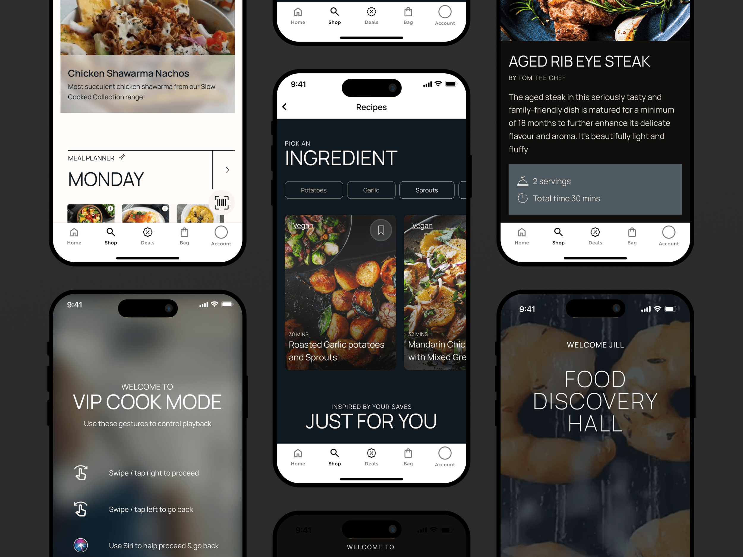
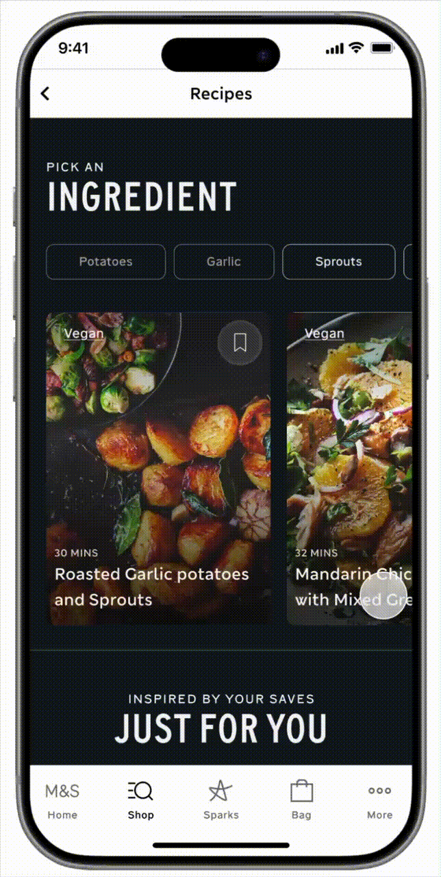
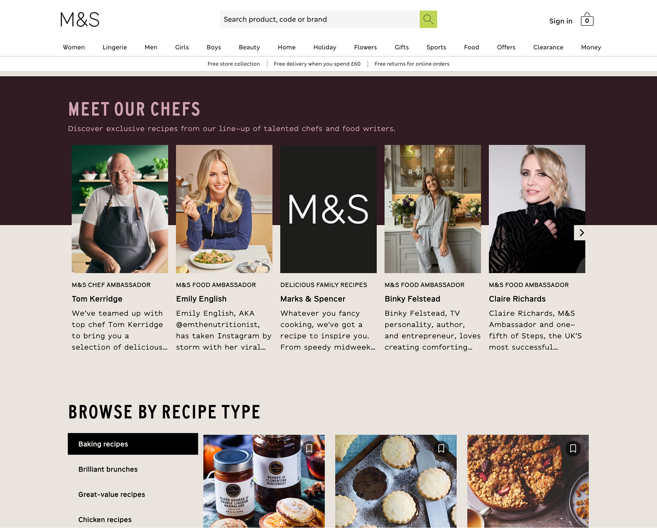
Enhanced Recipe Section
I enhanced the recipe experience to be more engaging, community-driven, and inspirational—transforming it from a static utility into a dynamic discovery space. By introducing socially influenced content, richer storytelling, and guided experiences, users can explore new recipes in a way that feels relevant and motivating.
Social Community Recipes
The Social Share Recipes experience brings food discovery to life through short-form video reels from across platforms, showcasing real people creating inspiring dishes. By blending entertainment with utility, users can instantly add all ingredients from a recipe to their shopping list, turning inspiration into action.
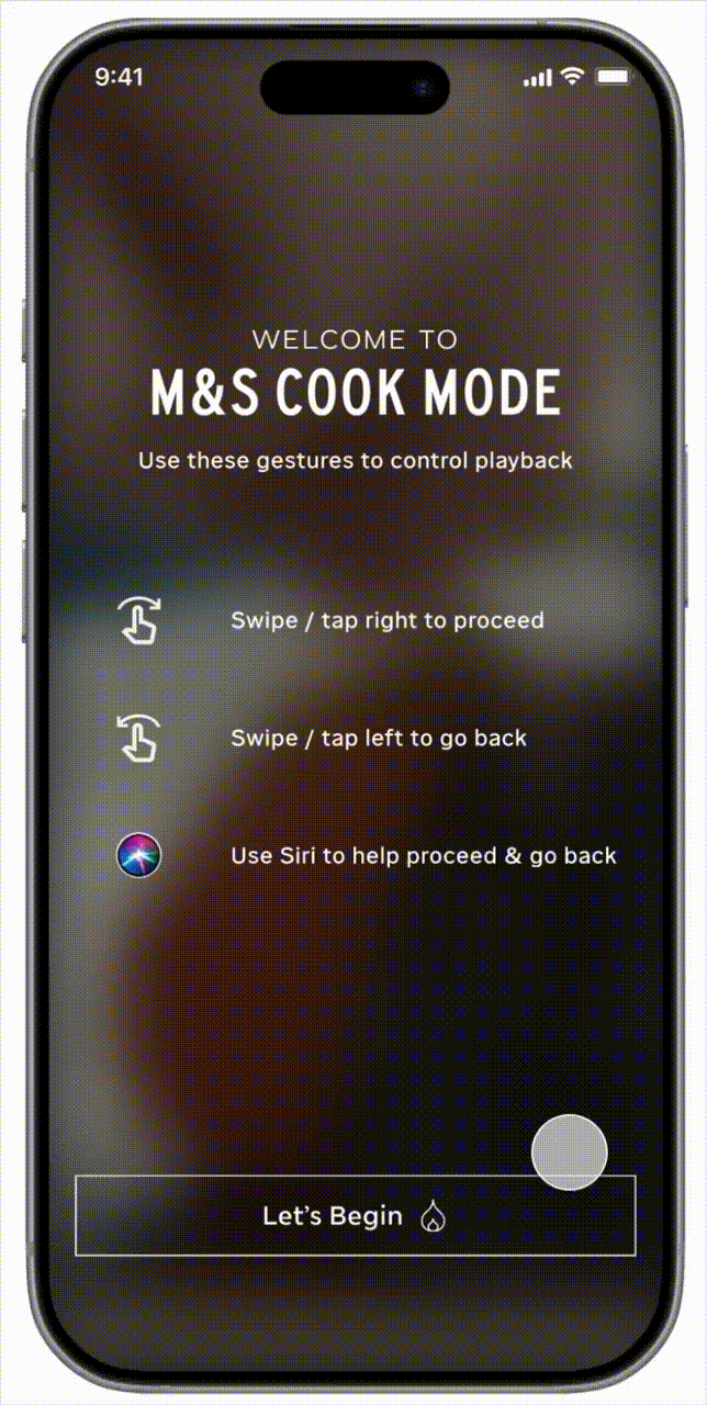
VIP Recipes with Cook Mode Experience
VIP Recipes introduces exclusive, chef-crafted dishes that elevate everyday cooking into a premium, guided experience. Users can seamlessly add all ingredients to their shopping list. and, once ready, enter Cook Mode to follow step-by-step instructions in real time. By combining aspiration with ease, this feature encourages users to return in-store to try new recipes and build a habit around discovering what’s next.
Cook Mode Experience
Cook Mode transforms inspiration into action by guiding users through each step of the recipe in a focused, real-time experience. With clear instructions, intuitive pacing, and hands-free navigation with the help of Siri, it removes friction in the kitchen and builds confidence as users cook. By turning every recipe into a seamless, start-to-finish journey,
Testing Before Scaling:
Web-First Validation Strategy
To validate our design decisions with minimal risk, the updated food discovery flows were first tested on the website before being implemented in the iOS app. This approach allowed the team to gather real user behavior data, measure engagement, and iterate quickly in a live environment. Insights from this testing phase helped de-risk the solution and ensure a more informed, effective rollout before pushing updates to the App Store.
Impact Outcomes
+18–25% increase in basket size
Users following recipes added more complementary items (full meal builds vs single products).
+9–15% increased in-store visits
Digital inspiration translated into physical footfall.
+25 NPS lift among engaged users
Users perceived M&S as more helpful, premium, and experience-driven.
Self-Reflection & Next Steps
While the redesign significantly improves discoverability, future opportunities include:
Personalizing content based on user behaviour
Enhancing recommendations across recipes and products
In-Store mode to personalize experience based off of store location
View More Recent Projects
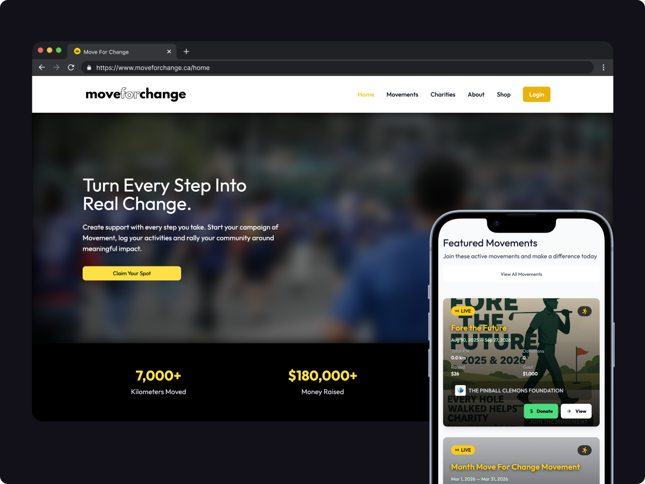
Move For Change
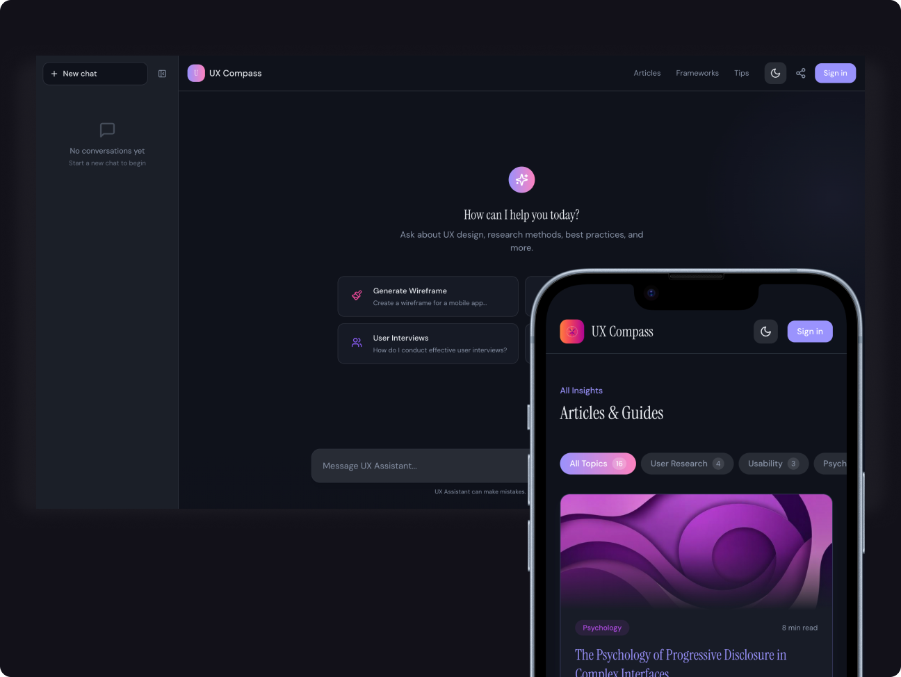
UX Compass
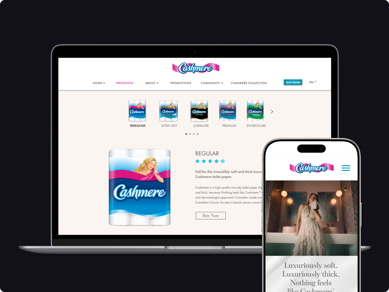
Cashmere